Adding Content
Once you've completed the initial set up you'll need to add content to your site. The following passages instruct you on how to add posts, images, widgets and sections. As always, if you have any questions not covered in this help file please email our Support System.
Adding Posts Adding posts to your site.
To add a new post, navigate to Posts > Add New. Enter the title, post content, assign various categories, upload images, add video, or add review elements to the post. Once you've created a new post be sure to Save Draft or Publish, in order to save the changes.

Shortcodes
The theme comes with a number of shortcodes allowing you to add styled content to your site with little effort. Shortcodes can embed files or create objects that would normally require lots of complicated code in just one line.
Conveniently, the available shortcodes have been included as buttons in the WYSIWYG content editor. When creating a page or post, click the desired shortcode icon to insert your code. Simply hover over the buttons to see what shortcodes you’ll be inserting.

Be sure you have installed the Shortcode plugin by visiting the section Plugin Setup under the Setup tab of Theme Help.
Types of Shortcodes
Below are explanations for the various types of custom shortcodes that come with the theme.
Column Shortcodes
Column shortcodes give you the versatility of creating variable layouts on a page. You can break paragraphs, images, and even other shortcodes into columns of your chosing. Columns are also responsive, and will automatically format themselves for mobile viewing.
Note: You must end each set of columns with a parameter position of last.
[tw-column width="one-half"] Insert you content here [/tw-column]
[tw-column width="one-half" position="last"] Insert you content here [/tw-column]
Columns go in halfs, thirds, fourths, fifths and sixths.
| Column | Last Column of the Row: |
|---|---|
[tw-column width="one-half"]content[/tw-column] |
[tw-column width="one-half" position="last"]content[/tw-column] |
[tw-column width="one-third"]content[one_third] |
[tw-column width="one-third" position="last"]content[/tw-column] |
[tw-column width="one_fourth"]content[/tw-column] |
[tw-column width="one-fourth" position="last"]content[/tw-column] |
[tw-column width="two-third"]content[/tw-column] |
[tw-column width="two-third" position="last"]content[/tw-column] |
| ...etc. | ...etc. |
| Parameters: | Options: |
|---|---|
| Width | The width of the columns, such as one-half,one-third,one-fifth etc. |
| Position | Enter a position oflast, only for the final column in the set, see example above. |
Button Shortcodes
These button shortcodes allows you to insert a button into your content and can be linked to the destination URL of your choice.
[tw-button size="large" background="#000000" color="gray" target="_blank" link="#"]Button[/tw-button]
[tw-button size="small" background="#000000" color="" target="_self" link="#"]Submit[/tw-button]
| Parameters: | Options: |
|---|---|
| size | Select the size of the button from small,medium,large. |
| background | Enter an optional background color for the button. |
| color | Select the color for the button, gray,blue,red etc. When left blank it uses the theme color. |
| target | The button link._blank opens in a new window, _self opens in the same window. |
| link | Enter the button link between. |
Titled Divider Shortcode
This shortcode lets you place a divider anywhere. The divider will automatically match the width of it’s container. For instance, if you want a half-width divider, place it inside a one-half column shortcode.
[divider]The Title Here[/divider]
Lightbox Shortcode
A lightbox shortcode creates a link to a PrettyPhoto lightbox. The contents of the lightbox popup are indicated with the link="//www.example.com".
[lightbox link="//www.example.com/image.jpg"]Link text or image here.[/lightbox]
Inline content Follows this form:
[lightbox link="#inline-content"]Link Text[/lightbox]
Tabs Shortcode
The featured tabs shortcode allows you to insert content into multiple featured tabs. The tabs can be viewed in by the user. You can include any number of tabs but you must ensure the number of titles and tabs match
[tabs tab1="Tab 1 Title" tab2="Tab 2 Title" tab3="Tab 3 Title"]
[tab]Tab 1 Content[/tab]
[tab]Tab 2 Content[/tab]
[tab]Tab 3 Content[/tab]
[/tabs]
Posts Shortcode
The posts shorcode allows you to display recent posts.
[tw-posts title="Title" number="4" category="reviews" content="yes" type=""][/tw-posts]
Social Icon Shortcodes
Add elegant icon links to your favorite social networks.
[social icon="twitter" url="//twitter.com/#" title="Follow Us" target="blank"][/social]
| Parameters: | Options: |
|---|---|
| icon | "twitter", "facebook", "google","dribbble", "linkedin" , "pinterest", and "rss" |
| target | "blank" - Opens in a new window. "self" - Opens in the current window |
| title | For hover and SEO purposes. Examples: "Follow Us", "Pin it" or "Like on Facebook" |
| url | Be sure this begins with // |
| class | Give a class to your social icon for advanced styling purposes |
Accordion Shortcode
Add accordions your theme, a clickable region where only one section can be opened at a time. Add to any page, section or widget area. The accordion section MUST be wrapped in an accordion shortcode.
[accordion]
[accordion_section title="Title"]Accordion Section Content Here.[/accordion_section]
[accordion_section title="Title"]Accordion Section Content Here. [/accordion_section]
[accordion_section title="Title"]Accordion Section Content Here.[/accordion_section]
[/accordion]
Toggle Shortcode
Add toggles your theme, a clickable region where mulitple sections can be opened at a time. Add to any page, section or widget area.
[toggle title="title"]Toggle Content Here.[/toggle]
[toggle title="title"]Toggle Content Here.[/toggle]
[toggle title="title"]Toggle Content Here.[/toggle]
Pricing Table Shortcode
The pricing table shortcode allows you to add pricing tables with a variety of layouts and options. A list can be added inside the table.
List items are a great way to showcase features. [pricing] shortcodes must be wrapped in a [pricing_table] shortcode.
[pricing_table]
[pricing size="one-half" featured="no" plan="Silver" cost="$10" per="month" button_url="#" button_text="Purchase" button_target="self"]
<ul>
<li>Feature</li>
<li>Feature</li>
</ul>
[/pricing]
[pricing size="one-half" position="last" featured="yes" plan="Gold" cost="$10" per="month"
button_url="#" button_text="Purchase" button_target="self"]
<ul>
<li>Feature</li>
<li>Feature</li>
</ul>
[/pricing]
[/pricing_table]
Customize your pricing table by adding the following parameters.
| Parameters: | Options: |
|---|---|
| featured | "no" - will show default color "yes" - will show in highlight color |
| cost | List the price for your itemsuch as "$10" or "Free". |
| per | List the frequency such as "month" or "year". |
| position | "last" - lists the table last if there is more than one table. |
| plan | Give the plan a name such as "Gold" or "Limited". |
| size | Similar to column sizing, "one-half" - default, "one-third", or "one-forth" |
| button_color | "red", "orange", "yellow", "green", "blue" or "purple" |
| button_text | "Purchase" or "Start Trial", for example. |
| button_target | "blank" - opens in a new window. "self" - open in the current window. |
| button_url | Link your table to a new page with a url. |
Sections Flexible Content Areas
Sections are flexible content areas you can use throughout your site. Once you create sections, you can add them to any page you like, or even use the same section in multiple pages.
Creating Sections
To create a section, navigate to Section > Add New. Enter the title of your section. This title is for imformational purposes and will NOT display on the site. The main title entered is just to keep track of your Sections on the WordPress Admin backend of the theme. Next you will need to select the type of section you'd like to create. You can learn more about the types of sections below.s
Once you've chosen the type of Section and customized it according to the descriptions below, click Publish to save and create your Section. See the passage Adding Sections to began placing your Sections on pages.
Types of Sections
There are six different types of Sections you can create, each with their own features and options. Below are explanations for each type of Section.
Full Width Slideshow
The full width slideshow section displays posts in a full-width slideshow format.
This slideshow only shows posts with images.
| Option | Description |
|---|---|
| Full Width Slideshow Type | Choose between a Tabbed or Carousel Slideshow. |
| Autoplay | Select whether or not you want the slideshow to automatically play by default. |
| Type of Post | Select whether you want the most recent or featured posts to display. |
| Posts to Show | Narrow down the displayed posts even further by selecting a specfic Category or Tag. |
| Category or Tag | If you decided to show a specific Category or Tag, choose one or more from the list of those already created by holding shift. |
| Number of Posts | Enter the maximum number of posts you want displayed on your page. |
| Carousel Width (Carousel Only) |
Select either a full width which spans the entire page or fixed width which matches the width of the content. |
| Carousel Item Size (Carousel Only) |
Select either a square image or letterbox image size. |
Grid Section
The grid section displays a grid of posts, with either a sidebar or full-width formats.
| Option | Description |
|---|---|
| Grid Type | Choose between full width or a grid with a sidebar. |
| Type of Post | Select whether you want the most recent or featured posts to display. |
| Posts to Show | Narrow down the displayed posts even further by selecting a specfic Category or Tag. |
| Category or Tag | If you decided to show a specific Category or Tag, choose one or more from the list of those already created by holding shift. |
| Number of Posts | Enter the maximum number of posts you want displayed on your page. |
| Ajax Pagination | Turn Ajax on to make more pages available, off hides pagination and all posts will appear on one page. |
| Grid Sidebar (Grid Sidebar Section Only) |
Add widgets to the Grid Section sidebar. In a new tab visit Appearance > Widgets and drag Widgets you'd like to use into the Grid Section Sidebar area.
|


Post Section
The post section displays a posts in a two column format.
| Option | Description |
|---|---|
| Type of Post | Select whether you want the most recent or featured posts to display. |
| Posts to Show | Narrow down the displayed posts even further by selecting a specfic Category or Tag. |
| Category or Tag | If you decided to show a specific Category or Tag, choose one or more from the list of those already created by holding shift. |
| Number of Posts | Enter the maximum number of posts you want displayed on your page. |
| Ajax Pagination | Turn Ajax on to make more pages available, off hides pagination and all posts will appear on one page. |
| Posts Section Sidebar (Posts Sidebar Section Only) |
Add widgets to the Post Section sidebar. In a new tab visit Appearance > Widgets and drag the widgets you'd like to use into the Posts Section Sidebar area, they are now availble for the sidebar in your post section. Refresh the Add Section tab and the widgets should be availble. Click + to add them into the section's sidebar, they will now appear in the right box. To remove from the side hover and click - and the widget will now only be listed in the left side box. (Note: see Grid Section for image examples.) |
Full Feature Section
A full width section that features a post, category, or tag.
| Option | Description |
|---|---|
| Full Feature Type | Select whether you want to display posts. |
| Type of Post | Select whether you want the most recent or featured posts to display. |
| Posts to Show | Narrow down the displayed posts even further by selecting a specfic Category or Tag. |
| Category or Tag | If you decided to show a specific Category or Tag, choose one or more from the list of those already created by holding shift. |
| Number of Posts | Enter the maximum number of posts you want displayed on your page. |
Ad Section
Create an Advertisement Section for any page or post.
| Option | Description |
|---|---|
| Ad Type | Select the method for imputing your ad, between pasting code or uploading an image. |
| Ad Code | Copy and paste your ad code here. The recommended size is leaderboard or 728x90. |
| Ad Image | Click Add Image to upload, the recommended size is 728x90. |
| Ad URL | Link the image from the URL, be sure it begins with //. |
Content Section
Create a Section with text content. You can add shortcodes, images and text.
| Option | Description |
|---|---|
| Content Layout | Choose between a full width or sidebar layout for the content section. |
| Section Content | Use the text box to type in the content you wish to display in the section. It can be customized with WordPress shortcodes or by adding media. |
| Content Section Sidebar (Content Sidebar Section Only) |
Add widgets to the Content Section sidebar. In a new tab visit Appearance > Widgets and drag the widgets you'd like to use into the Content Section Sidebar area, they are now availble for the sidebar in your post section. Refresh the Add Section tab and the widgets should be availble. Click + to add them into the section's sidebar, they will now appear in the right box. To remove from the side hover and click - and the widget will now only be listed in the left side box. (Note: see Grid Section for image examples.) |
Adding and Ordering Sections
Before your sections will show up on your site, you need to add them to your page.
Navigate to any page where you would like to add your newly created Sections. Scroll down the page or post part way to find Custom Layout. Note: On the Homepage template, there will be two tabs, Custom Layout and Default Layout. The Default layout comes with the theme and sets up your Homepage Sections to appear as they do in the Theme Demo.
To add and arrange your own Section select the Custom Layout. A list of created Sections will appear by display title. Add Sections to the page by by clicking +, when they appear in the right column box they have been succesfully added to the post or page. To rearrange them simply drop and drag. Remove the Sections from the page by clicking -.

Adding Images
You can add images and galleries within your post and pages. Start by setting a featured image this will be used as your post thumbnail.
Adding a Featured Image
To add a featured image, click Set Featured Image, upload your image and choose Set Featured Image and then save the changes to your post. It is recommended that the featured image uploads are at least 1500px in width and 600px in height.

Adding Images within Pages or Posts
Images can be added to any content area and can be customized in various ways.
- To add an image navigate to any Page or Post. In the content area place the cursor where you would like the image to appear and click Insert Media.
-
Click the link
Insert Mediaabove your content editor -
Upload new images under the
Upload Filestab or insert exsisting images from the media library via theMedia Librarytab. -
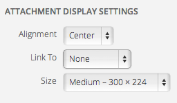
After selecting the image you can choose the display settings, you'll need to select your display settings.
-
Once the display settings are complete, insert the image into the content by clicking Insert into Post.
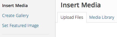

Image Display Settings
Under Attachment Display Settings in addition to the WordPress standard allignment of
Left, Center, Right and None the theme also includes Parallax.

Adding a Parallax Image
A parallax image is the full width of the page and remains fixed on the page while the rest of the content scrolls above and below it. Note: A parallax image should be at least 1500px wide to avoid exessive pixelation. Parallax will only work on pages without sidebars.
To add a parallax image to your post, follow the Adding Images to Page or Post
above. Then select Parallax for Alignment in the
Image Display Settings.
Adding Image Galleries
Image galleries can be added to any content area and can be customized in various ways. To add an image gallery navigate to any page or post and in the content area place the cursor where you would like the gallery to appear. Click Add Media to begin.
Click Create Gallery and upload new images under the Upload Files tab or select
images that exsist in your media library from the Media Library tab. Select Images for your Gallary
by clicking on them. Once you have all the images checked, click Create New Gallary

Now you can edit the gallary by entering captions and dropping and dragging images to change their order. The Gallery Settings are also selected at this point (See the following passages for information on the gallery settings). Once the gallery settings have been selected click Insert Gallery and the gallery will be inserted into your content area.
Gallery Settings
Below are explanations for gallery settings.
| Option | Description |
|---|---|
| Gallery Type | See preceding passage for information about each type. |
| Random Order | Decide whether you want the images displayed randomly or the order you specified via drag and drop. |
| Cropping Slideshow gallary type only |
Select "Crop Images" so they all appear the same height in the slideshow. Or select "Do not Crop Images" and the slideshow will resize according to the image height. |
| Link Slideshow gallary type only |
Select None if the image should not have a link or Full Image if you’d like it to link to the full image when clicked on.
When linking to the full image it opens in a responsive lightbox. |
Gallery Types
Below are explanations and design tips for the different types of image galleries.
| Option | Description |
|---|---|
| Gallery | This gallery type is your traditional gallery, displaying a block of thumbnails that when linked to the full image
open in a responsive lightbox. The captions appear upon hovering. The gallery type is only available in a fixed width. Design Tip: A gallery looks great when displaying images in multiples of three. |
| Slideshow | This gallery type displays a slideshow where the entire image is shown and the user can click scroll left or right through the gallery.
Captions are optional and will display on the image. The slideshow gallery type also has the option of cropping so the slideshow will remain
the same height. If the images are not cropped the height will adjust for each image. Design tip: Create a Slideshow gallery with only one image, and make sure it’s full width. This creates a dramatic, break out of the box image on your post, page or portfolio item. |
Widgets
There are four custom Widgets along with the standard Widgets included with WordPress.
Adding Widgets
The widgets can be found under Appearance > Widgets. Widgets can be placed in the footer, and various sidebars on pages and sections. To activate a Widget in a sidebar or footer simply drag it to the desired area, or click the Widget, select a destination and click Add Widget.
Arrange the order of Widgets by clicking and dragging them it into place. You can customize the Widget features by clicking the down arrow in the upper right corner. Be sure to save any changes made to the Widget by clicking Save. To remove the Widget, click Delete.
Custom Widgets
Below are explanations for the Custom Widgets that are included with Edition.
-
Custom News Widget
A Widget that allows you to display the most recent blog posts from a specific category.
Option Description Title You can an optional title for the Widget. Number of Posts Enter the number of posts you'd like to display, it must be at least 1 and less than 10. Choose a Category Select a specific category in which the posts are pulled -
Themewich Popular Posts Widget
A Custom Themewich Widget that displays popular posts, recent posts, and an optional facebook feed.
Option Description Tabs Title You can an optional title for the Widget. Number of Posts Enter the number of posts you'd like to display, it must be at least 1. -
SocialFans Counter Widget
A Widget that allows you to display social links with subscribe/like counts. Supports the following networks: Facebook, Twitter, Google+, Pinterest, Linkedin, FourSquare, Envato, Behance, Dribble, Vimeo, Soundcloud, Forrst, Github, Mailchimp, Delicious, Instgram, Youtube, Rss, VK-VKontakte, Vine, and Tumblr.
To set up the Social network accounts navigate to SocialFans > Settings. Check the boxes of the social networks you'd like to display on the widget. Use the dropdown arrow to open the details for each network and fill out the account information. For help on finding the correct account information visit the help link on the right side, such as
Need help for Facebook? click here, shown in the example below.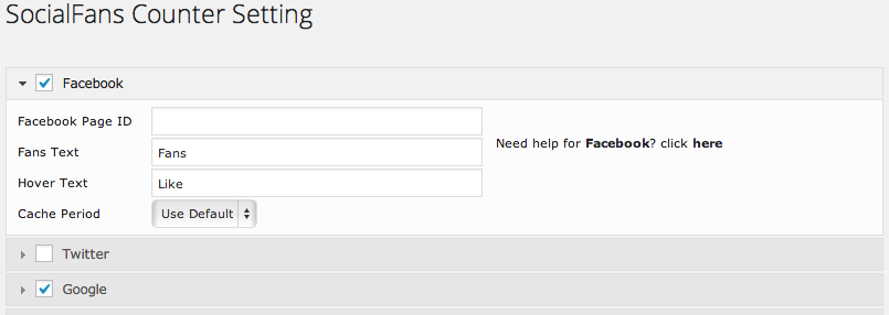
Once you've selected the social networks and completed the required account information you can sort them in the desired order you'd like them to appear by dropping and dragging.
Navigate to Appearance > Widgets and place the SocialFans widget in the desired area. Customize the look of your social network icons by adjusting the widget settings, described below.
Option Description Tabs Title You can add optional title for the Widget. Number of Posts Enter the number of posts you'd like to display, it must be at least 1. New Window Check if you'd like it to open in a new window. Nofollow Links You can an optional title for the Widget. Hide Title You can show or hide the title for the Widget. Show Total Show sum of social accounts fans, such as twitter followers. Columns Select the number of columns for the icons to appear within. Effects Adjust the effects of the widget. Icon/Text Color Change the icon or text here. Background Color Change the background color of the social icon grid. Hover Text Color Adjust the hover text color. Hover Text Background Color Adjust the hover text background color. -
Ninja Forms Widget
A Widget that allows you to display custom forms such as a contact form. See passage about creating Custom Forms for more information.
Option Description Display Title You can display the title for the Widget. Forms Dropdown Select the form you'd like to display in the Widget.

Forms Setup
Create custom and manage forms for your widgets or pages.
Managing the Contact Form
Update the Contact Form with your own information, visit Forms > All Forms and select Contact Forms.
Under From Email Settings enter the following:
| Option | Description |
|---|---|
| From Name | Enter the name you would like the form to come from. |
| From Email Address | Enter the email address you would like the form to come from. |
| Email Type | Select whether the email will be sent as HTML or plain text format. |
Under Administrator Email Settings enter the following:
| Option | Description |
|---|---|
| Administrator Email Addresses | Enter the email addresses for as many people as you like to receive notification when a user successfully submits your form. |
| Admin Subject | Enter a subject that the above email addresses assigned will receive. |
| Admin Email Message | Create an message that will be emailed to the above admin email addresses. |
| Include a List of Field | Check if you wish to send a table of the users complete submission at the end of your message. |
| Attach CSV of submission | Check if you wish to attach a list of the message in an excel format. |
Under User Email Settings enter the following:
| Option | Description |
|---|---|
| Subject for the user email | Enter the subject users will receive if you choose to send them an email upon successful form submission. |
| Email message sent to the user | Enter the message that will be emailed to the users after they successfully complete the form |
| Include a List of Field | Check if you wish to send a table of the users complete submission at the end of your message. |
Adjust theBasic Settings Behavior Settingsfor your form:
| Option | Description |
|---|---|
| Display Form Title | Check if you'd like to display the form title. |
| Require user to be logged in to view form? | Check box to require. |
| Add form to this page | Select from your already created page from the downdown. |
| Submit Via Ajax | Check if you want your form to be processed without the page reloading. |
| Success Message | Enter a message which will appear once the user successfully submits the form. |
| Limit Submissions | Select the number of submissions that this form will accept. Leave empty for no limit. |
| Limit Reached Message | Enter a message to be displayed once the limit has been met. |
After completeing the above as needed, click Save Form Settings to make sure the changes to your Contact Form have been saved.
Creating Custom Forms
More advanced users can create a Custom Form for any page or widget.
Create a custom form by navigating to Forms > Add New. Under the Form Settings begin entering the
the form email information. Such as From Email Settings, Administrator Email Settings, User Email Settings and Basic Form Behavior Settings.
When you are finished with filling out desired fields of the form, click Save Form Settings
Under the Field Settings tab is where you add the fields, textboxes, dropdowns, and buttons to your form. Such as user information
text fields, anti-spam fields, and submit buttons. The field elements can be dropped and dragged into the desired order and then previewed live
under the tab Form Preview. Be sure to click Save Form Settings when the form is complete.
Note: There are many options and customizations available with Ninja Forms when creating a Custom Form. For more detailed explanations on the field elements and their features please visit Ninja Forms Documentation.